This is the final project! A virtual exposition of La Chinita`s Fair! We made this Exposition in the URBE EFL Center in Second Life. We decided to make a Stand and put it in the middle of the place, it has to faces, it is like a triptic.

Main features of the event
Composition:
The format of this project is an stand with the form of a tryptic, it also have an oval form in the top of it that move. Has a simple diagram, vertical, using a lot of images, the reticle has tree columns in vertical.
Design determiners:

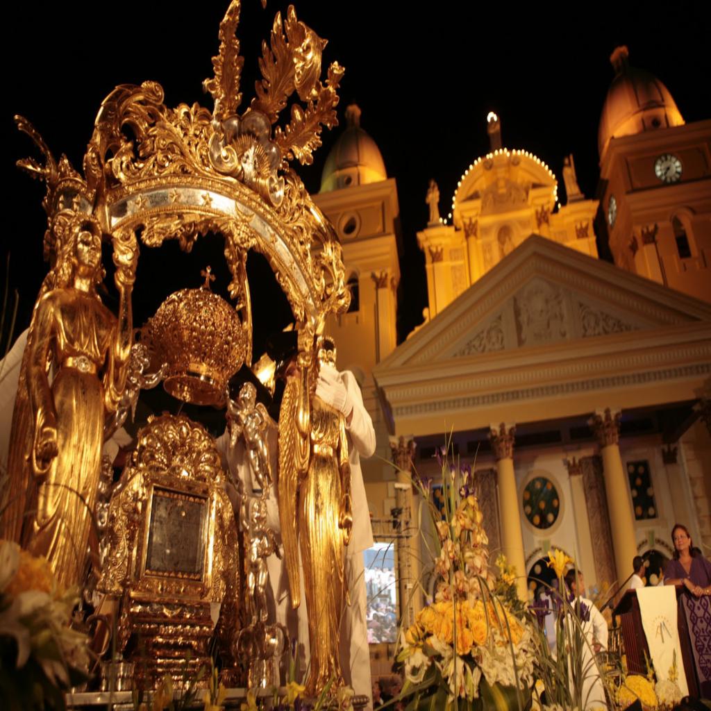
Image Style: The determiner of this stand is the using of the typical colors and shapes of the fair, also using images taken of the monument representatives.
Color: The determiner of the color was vivid colors, like blue or reds.

Fonts: We use Serif typography with ornaments.
Graphic elements: We use photographs and vectors.

Graphemes: We use vectorisation of the monument of la chinita for a poster, and images with special effects.
Visual Rhetoric: We use the sinecdoque because it expresses the part for all.
Semiotic: We use it in the symbols of la chinita, in the pictures. We also use paradigmatic relatiens where signs get meaning from their association with other signs.
Advertising: The message that we use was ``chinita`s fair``, because it is consistent and leaves you just right to the meaning of the project.
Graphic Concept
Our 3 meaningful terms were: Inspiring, religion and fair.
Sistagmatic relation: This was stablich by the meaning of the fair la chinita and the history of the fair.

I MADE THE ANALISIS OF THIS PROJECT, I ANALISE ALL OF THE ELEMNTS THAT WE USE TO DESIGN THIS STAND. IS WAS FUN!
No hay comentarios:
Publicar un comentario